MITCHELL DAVIES
Home
About
Portfolio
Contact
In the first session of the year in Digital Media at UWE, we were set a task of creating our first website on the site 'HotGlue'. We were allowed the freedom of creating anything we liked as long as there was interactivity involved.
I decided to make the most random thing I could - here is the outcome:
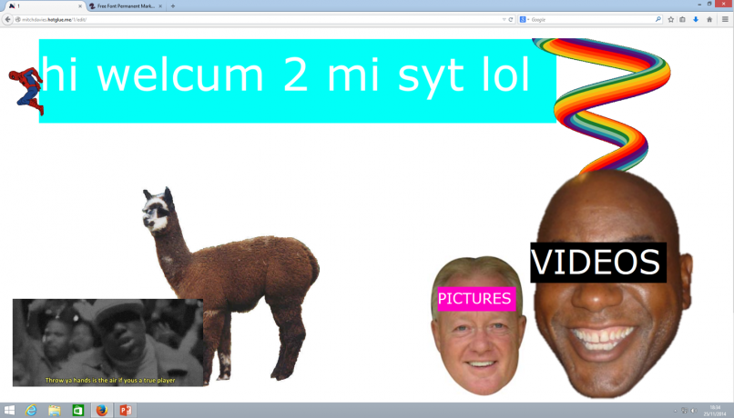
At the time I was ultimately happy with the outcome as it was the first website I had ever built. However, I forgot to include interactivity to my website. I therefore added two links called 'Pictures' and 'Videos' to take the user to separate domains within my website. I also didn't like how much white background I had there, so I tried to add more pictures.
I tested the outcome on my iPhone and noticed that the screen was way too big for the phone screen and it was extremely slow. I then realised it was because there were too many GIFs on my website running at once. I therefore had to remove some of the GIFs to allow better webpage roaming for all platforms.
In our second session we evaluated our first HotGlue websites with a range of different tests including trying our websites on alternate browsers, connections, phones etc. and evaluated the interactivity, size, layout and many other crucial elements to our sites.
Here is the outcome on the sheet I filled out when evaluating my HotGlue website:


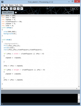
In the third week we moved onto something entirely different - programming on Processing.
This was new to me as I'd never attempted any sort of computer coding in my life.
Firstly, we were introduced to the programme 'Processing 2' where some of us would be making our first ever code.
After many trials and errors I managed to make my first Processing code:
I had many difficulties with embedding my Processing onto this HotGlue page so I had to video my sketch and upload it to YouTube. Apart from that I was pleased with my first outcome as it worked well with no glitches or lagging. I also tried to adapt what they were teaching me into something a bit more complex which I think I achieved. The only issue I had at the end result was the visibility of the yellow section in the colour chart. However, I looked past it to focus on my next task the following week - working on my final sketch.
For my next assignment I had to create my own code - and it could do anything I wanted.
I looked through all the possible codes that you could do on Processing to gain some ideas of what I wanted my outcome to be.
I saw some codes that played with particles of pictures such as making them explode or move around and liked the idea. I therefore decided that I would make a picture explode with the click of a button. In one of the examples in the Processing programme it showed a picture of a house and when you moved the mouse right the particles would explode towards you in order of brightness and colour (the brighter coloured particles would travel faster). I wanted to use this idea for my own project but instead with a press of the mouse the particles would explode and reform on its own.


I encountered many problems along the way whilst trying to structure my script. The one that occurred the most was that the Processing application could not identify the 'explosionValue' I had put in my script. I also noticed that on several occasions Processing could not locate the picture I wanted to use, this changed when I re-allocated the picture to the folder 'Processing' in my documents.
This is the picture I wanted to use in my script:
As random as it is, it was a good test to see if
the lighter colours would travel faster.
On the seventh week we focused on the aesthetics of making a successfully built portfolio on HotGlue.
We were shown many different criteria in order of significance, I tried to stick to this basis as much as I could throughout.
Once I figured out the site objectives, functions, interactions etc. I decided to design a few layouts for my HotGlue portfolio and to ultimately decide the look that I wanted my site to give off.
I found that the most successful thing to display the HotGlue site on was Mozilla Firefox on a Windows 8 computer. It was a lot quicker and more interactive than any other I had tested.
For my final assignment within the Web Design Studio course, we were asked to design and make a phone app on a website called 'Appfurnace'.
We were given 3 options as to what our app would do:
1) UWE “Freshers” Guide - An app that helps visitors and new students get around UWE.
2) An Event app - An app to support a conference or festival
3) A simple game (this would require Javascript programming to implement) - Examples are : Picture Dice game, Find the Lady (QR code game), A Quiz game
I decided on using option 2 (an event app) and chose to make an application for a big festivals among people living in Bristol - Love Saves The Day. I chose this because a lot of students attend this festival and, naturally, a lot of students have access to smartphones and download apps. After a lot of thought and consideration (and researching other festival apps) I figured out what was needed in my app to make for a good application experience.
The things I needed in my app:
- A link to take users to buy tickets.
- A gallery of pictures from last year.
- A link to the festivals social network sites.
- A navigational menu to take you anywhere in the app.
- News and updates of the festival and previous or announced artists.
- A line-up of the next event.
- Information about the festival, contact details and terms and conditions.
This was the first practice app I designed in the first week. It's purpose was to help people find good nights out coming up in their city based on what music they liked.
Although unfinished, I believe the outcome was successful as it did what I set out to do as well as being having easy navigation.
The following week it was time to start designing my app and planning the functionality.
I started with the home page which would take you to the navigational menu.
This is the homepage of the app, it's big, bold and inviting. Also, there is a picture of a young student which will apply to my target audience.
The 'enter' button slides the homepage left to reveal the menu page. This is where you explore most of the app.
These are a few examples of festivals apps that I found online. All contain links to social networking sites and have easily navigational menus.
I also coded a link on the 'Tickets' button to take the user to the Love Saves The Day section on Resident Advisor where you can purchase the tickets.
The problem I encountered here was that you could only use the link
on a smartphone which I didn't have so had to use other peoples phones
to check the progress and any errors I had.
There was a problem with the line-up page on my app as the line-up for Love Saves The Day 2015 had not been announced yet. I therefore had to put 'Line-up coming soon...' where the list of artists were originally going to go.
This is the Gallery page where the best photos from last years event can be viewed.
Each photo when pressed takes you to a separate page where the image can be viewed better. Also, upon pressing each of the pictures the LSTD logo appears.
All pictures are taken from the Love Saves The Day website and all feature a back button to return you to the picture gallery. Originally, I wanted to be able to swipe from picture to picture on the same page but unfortunately it is not supported on Appfurnace. I therefore had to use an alternative way which was creating a page for every picture. The navigation is still easly functionable but I would have hoped for a swiping code to make things smoother.
I looked on the Love Saves The Day website for some inspiration as the line-up had not been announced and the location was unnamed, which is what I wanted to put in the news and updates section of my app. On the website they were uploading mixes, videos, interviews and blogs to their news and updates page. I therefore coded a link on the play buttons to take the user to other websites. The first is a mix on Soundcloud by Phaeleh (a Bristolian DJ and rumoured for the next event) and the second takes you to YouTube for a video of
last years event.
The final page is the information section.
This has the social networking pages that I listed that I needed from the start. Each picture is a link to the festivals page within that website. I also added the actual contact details of Love Saves with each of the icons coded to open your email or to ring the number. However, I've had several problems on separate occasions where sometimes even though the code is correct it still will not do its function. Below the contact details is the event information and the terms and conditions. At the top is a map of Bristol marked with the location of last years event and where their official after parties were.
This is the first mock-up piece I came up with. Even though it's easy to navigate on the page, it's very simple and I believe it's set out very strangely.
I needed to look at examples and try to add my own personality to the page.
My second attempt at creating webpage designs was also my final. I liked the outcome of this as I believe it looks professional, neat and easy to use. It also made me think that it could fit on most platforms as it is a narrow compact design.
I experienced many problems from the start of this task. The first being that I couldn't figure out the preset for exploding particles. I managed to discover it with the help of a guest at our uni but then disaster. Weeks later I found that all my saved work was empty with no code in it. I tried to salvage as much as I could however I was back to square one as I was missing vital elements of my code.
I decided that it was best to go for something a little easier, as it was still a very new concept for me, yet also an original and fun idea.
After playing around with shapes and colours I decided that I'd combine the two to make boldly coloured patterns.
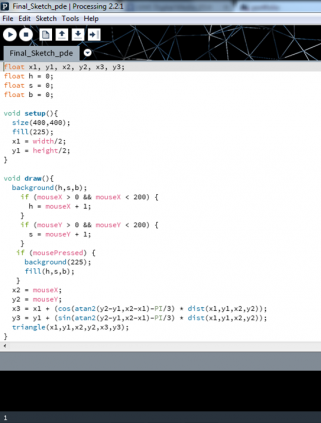
About a week later I ended up with this!:
Even though this isn't the final result I was hoping and planning for, I think this is a good substitute.
The result is an equilateral triangle that moves on a swivel from the top point of the triangle located in the middle. When the mouse is moved the triangle can change in size and can alternate directions. Also, depending on where the mouse is within the screen the background changes colour and saturation. When the mouse is pressed and held the colours of background and shape switch, making the shape change colour when the mouse is moved. Whatever colour the triangle is on when the mouse is released is what colour it stays until it is clicked again.
Overall I'm please with my outcome considering I had not much time left and encountered a lot of difficulties whilst trying to learn coding.

This is the design I went with in the end. I tried to stick with the original design as much as I could except for a few adjustments. Overall, I'm satisfied with the outcome as it's an extension of me and is well manoeuvrable.